
Designing a B2B Cybersecurity Marketing Website for the AI Era—From Discovery to Dev Handoff
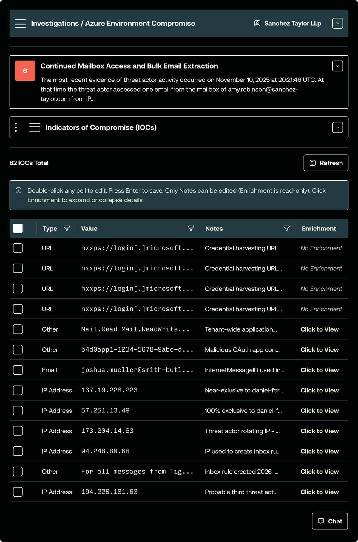
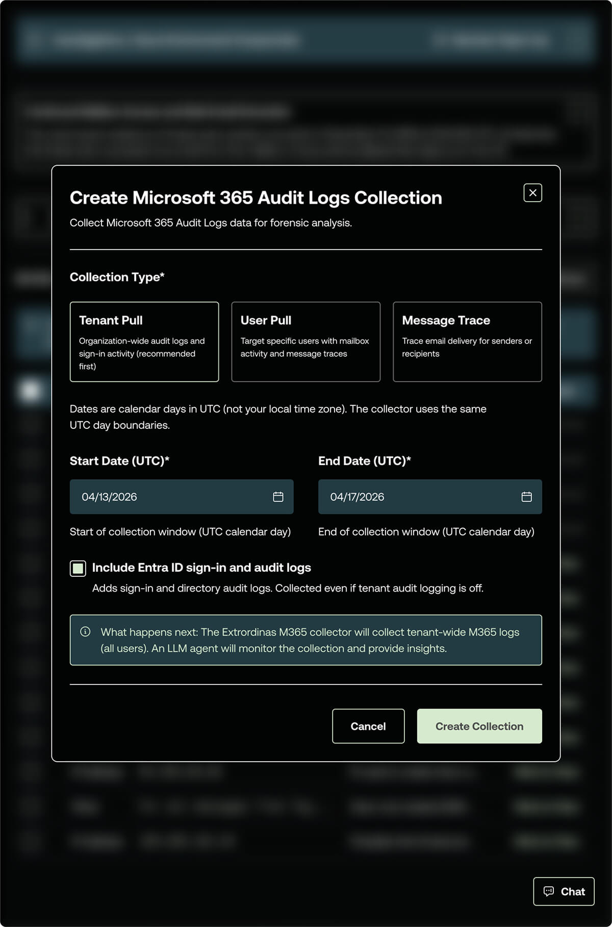
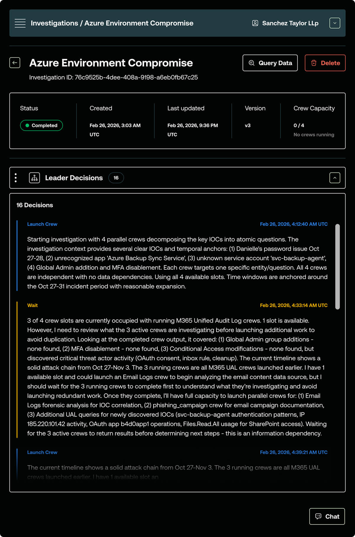
Extrordinas is a cybersecurity SaaS platform built to cut incident response times from weeks down to hours using AI-accelerated workflows. I led the full UX and UI design process—from initial information architecture through responsive design and a complete developer handoff—on a compressed timeline with no prior brand system or design foundation to build from.
Extrordinas reached out at an early stage with a highly complex product: AI-driven incident response. Security specialists have zero patience for vague positioning, and enterprise executives need to see clear ROI before requesting a demo.
The core challenge wasn't just translating this technical complexity—it was doing so from a remarkably thin starting point.
Every constraint on this project was a design problem in disguise. No brand guide, no existing site, no content library, and a product category most buyers have never encountered. Each of those gaps required a decision—and those decisions are what shaped the process.
I led this project end-to-end as the sole designer—covering discovery, competitive research, information architecture, wireframing, high-fidelity UI, and developer handoff. With no existing design foundation or prior site to build from, the work required close collaboration with the client at every stage to make sure the decisions held up—from the initial IA presentation through the final handoff review with the developer.
The subject matter and asset library was limited so the design needed to match the product design aesthetic while still providing a level of visual interest to captivate viewers. I focused on the following areas.
The early phase of information architecture (IA) usually brings the most friction. Synthesizing interview notes, strategy docs, and competitor research into a client-ready sitemap takes massive organizational time before the creative work even begins.
To accelerate this on Extrordinas, I used Claude as an architecture partner:
The product is sophisticated, but the marketing site isn't a documentation portal. Keeping the platform story on one page—with a clear narrative arc—keeps buyers oriented and moving toward the demo CTA rather than getting lost in nested subpages.
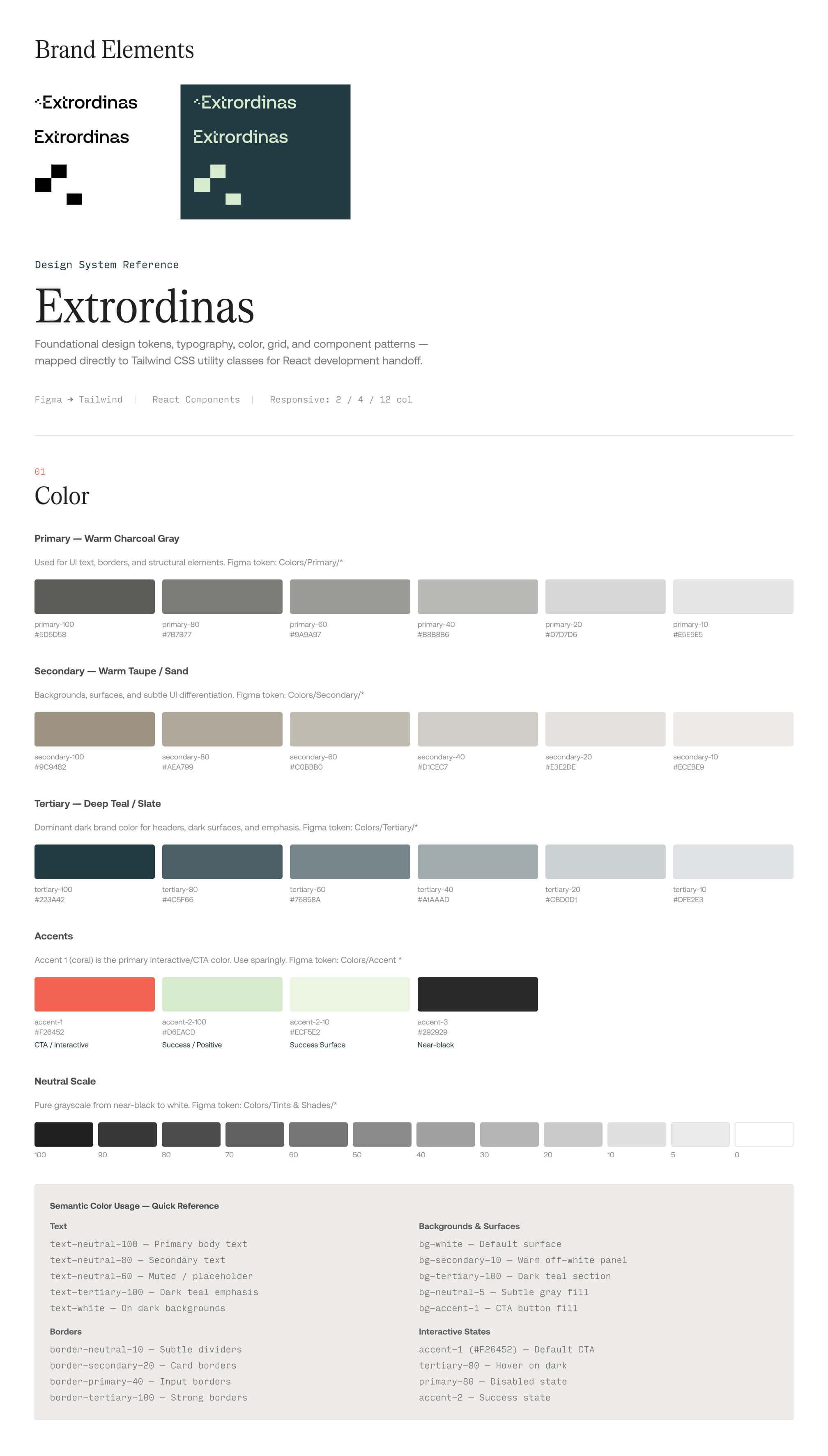
The Baseline: Building a production-ready design system from scratch usually takes me 3 to 4 hours of meticulous token mapping, variable setup, and color scale extrapolation.
The AI Acceleration: By feeding a custom, hand-built Figma variable template and the client’s brand hex codes into Claude, I automated the manual legwork:
H1–H6 variables and styles.The Handoff Ready System: I layered text, surface, brand, effect, and scaling tokens directly on top of these automated primitives.
The Impact: 30 minutes from start to finish. By offloading the mechanical logistics to AI, I won back 3.5 hours to focus entirely on high-level UX strategy and design judgment.
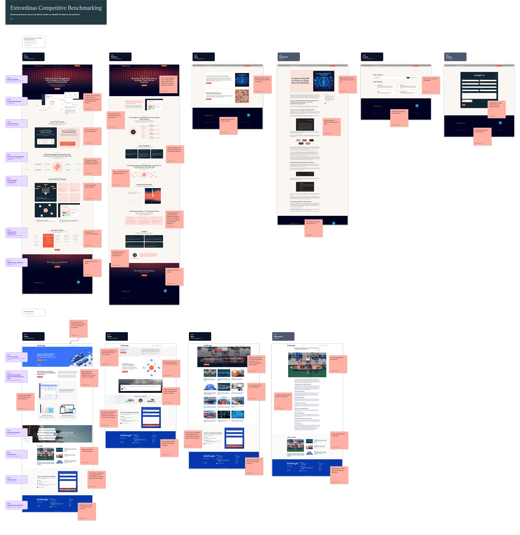
I did a full section-by-section review of two competitor sites the client flagged as directional benchmarks—Specular.ai and Blink Freight. I documented content strategy, aesthetic conventions, interaction patterns, navigation structure, and responsive behavior at both major breakpoints. These observations informed every major layout and content decision that followed—particularly the dark-mode, signal and bit visual language and the "complexity-behind-simplicity" content approach the brand needed.
The IA was the most critical deliverable of the early project phase. Get it wrong here, and every downstream phase inherits the problem. To prevent this, the final architecture didn't just map out pages—it introduced a content spec layer. Every single section of every page included defined content requirements, moving past a standard "labels and boxes" sitemap.
The pages I mapped based on our initial discovery session:
By mapping out exact content requirements directly in the architecture, this document instantly became a cross-functional utility:
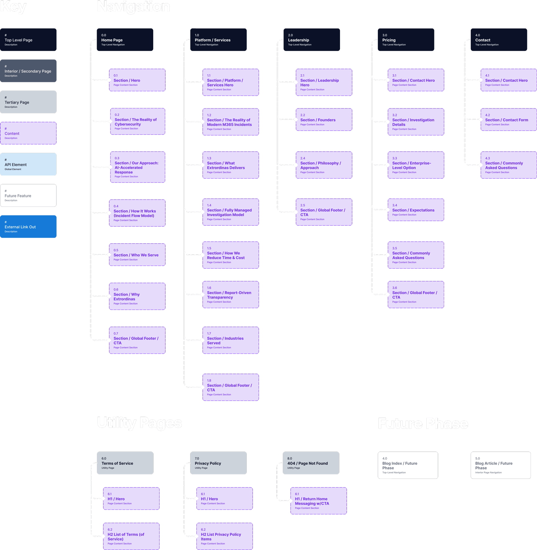
A few structural decisions worth calling out:
Buyers aren't just evaluating a product—they're evaluating whether the people behind it have the credibility to operate in a high-stakes environment. A dedicated leadership page lets that story breathe without crowding the primary conversion pages.
The product is sophisticated, but the marketing site isn't a documentation portal. Keeping the platform story on one page—with a clear narrative arc—keeps buyers oriented and moving toward the demo CTA rather than getting lost in nested subpages.
Documenting what was out of scope for v1 gave the client a clear picture of what the site could grow into, and it kept the build focused. Nothing kills a timeline faster than scope that creeps in because nobody drew a line.
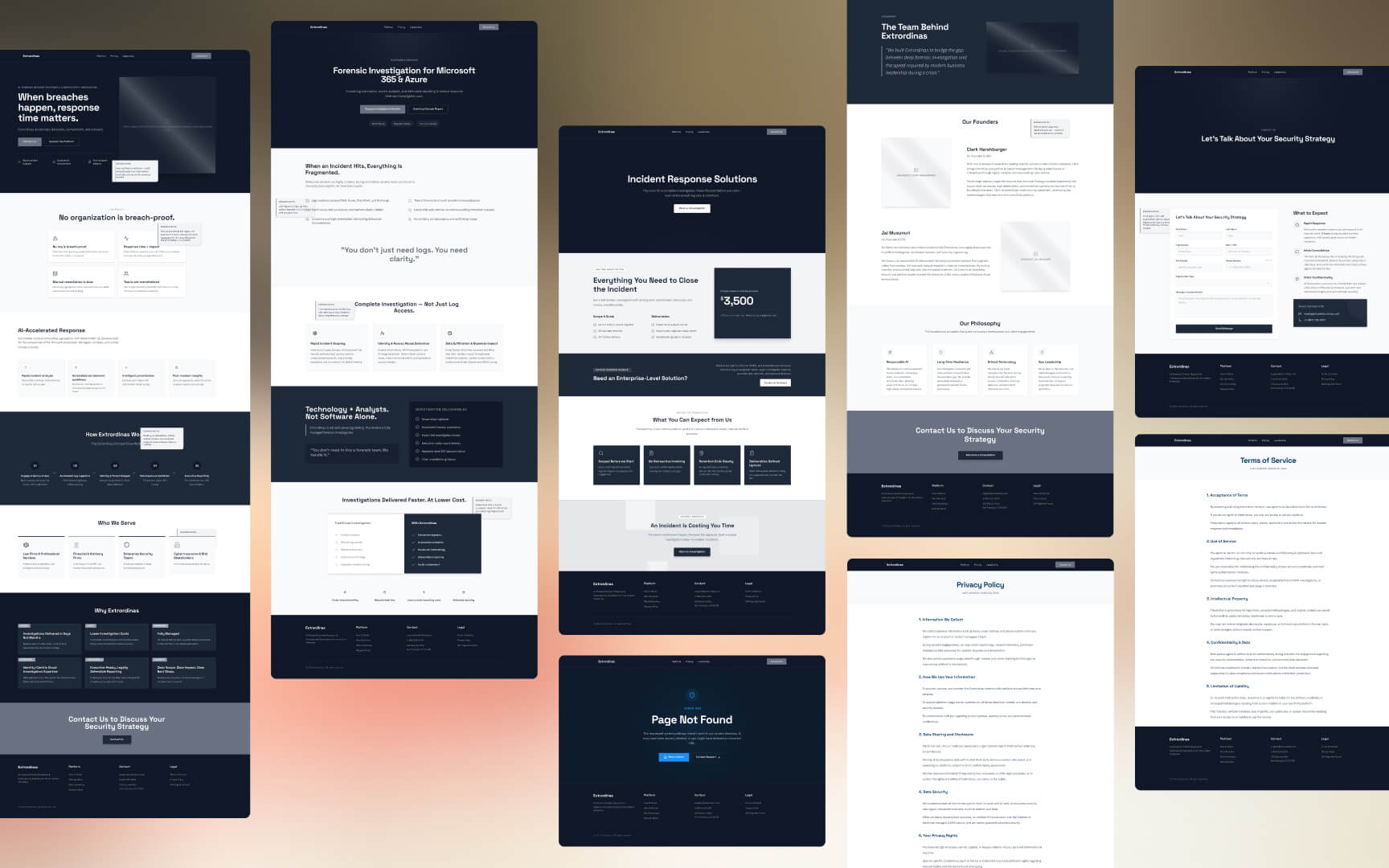
Wireframes are where the IA stops being a document and starts being a website.
Because the IA included section-level content specs for every page, I wasn't designing from a blank frame—I was solving a layout problem with defined inputs. That's a better constraint to work against. It keeps decisions grounded in what the page actually needs to communicate rather than what looks interesting in the abstract.
I used Figma Make to generate the wireframe outputs, feeding it the section-level content specs directly from the IA. Working at 1440px desktop as the primary breakpoint, I covered all primary pages before any visual design began. Figma Make handled the structural generation—my job was reviewing the output, making editorial decisions about hierarchy and sequencing, and pushing back where the layout didn't serve the content story.
A few things I was specifically solving for in the wireframe phase:
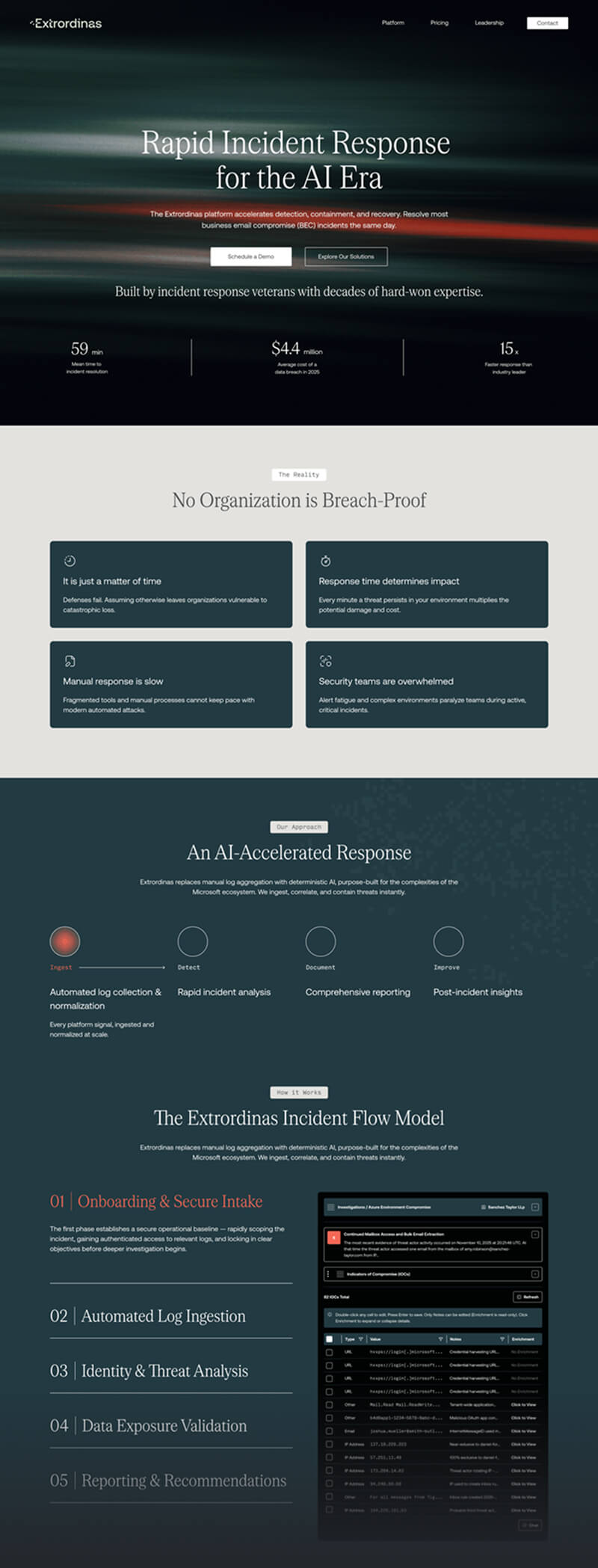
Extrordinas is operating in a crowded, high-skepticism market. The hero had one job: communicate what the product does and why it matters in under ten seconds. The wireframe tested whether that story held up structurally before any visual design got attached to it.
The wireframes worked through a few different sequences before landing on a narrative arc that moves from problem framing to solution architecture to specific capabilities—mimicking how a good sales conversation actually flows.
That sequencing discipline paid off. By the time I opened the brand system and started applying visual design, the structural decisions were already resolved. I wasn't redesigning pages—I was dressing frames that had already been validated.
With the wireframes validated, I moved into visual design—but before I touched a single high-fidelity frame, I needed a design system. On a ground-up build with three typefaces and a multi-layered color system, that foundation work can eat an entire day before any real design happens.
This is where the workflow shift paid off again. In about 30 minutes—using the process described above—I had a production-ready variable system built on top of my hand-built Figma template. Color tint scales, H1–H6 typography variables, and a full token architecture covering text, surface, brand, effect, and spacing. The system was ready before I opened a single high-fidelity frame.
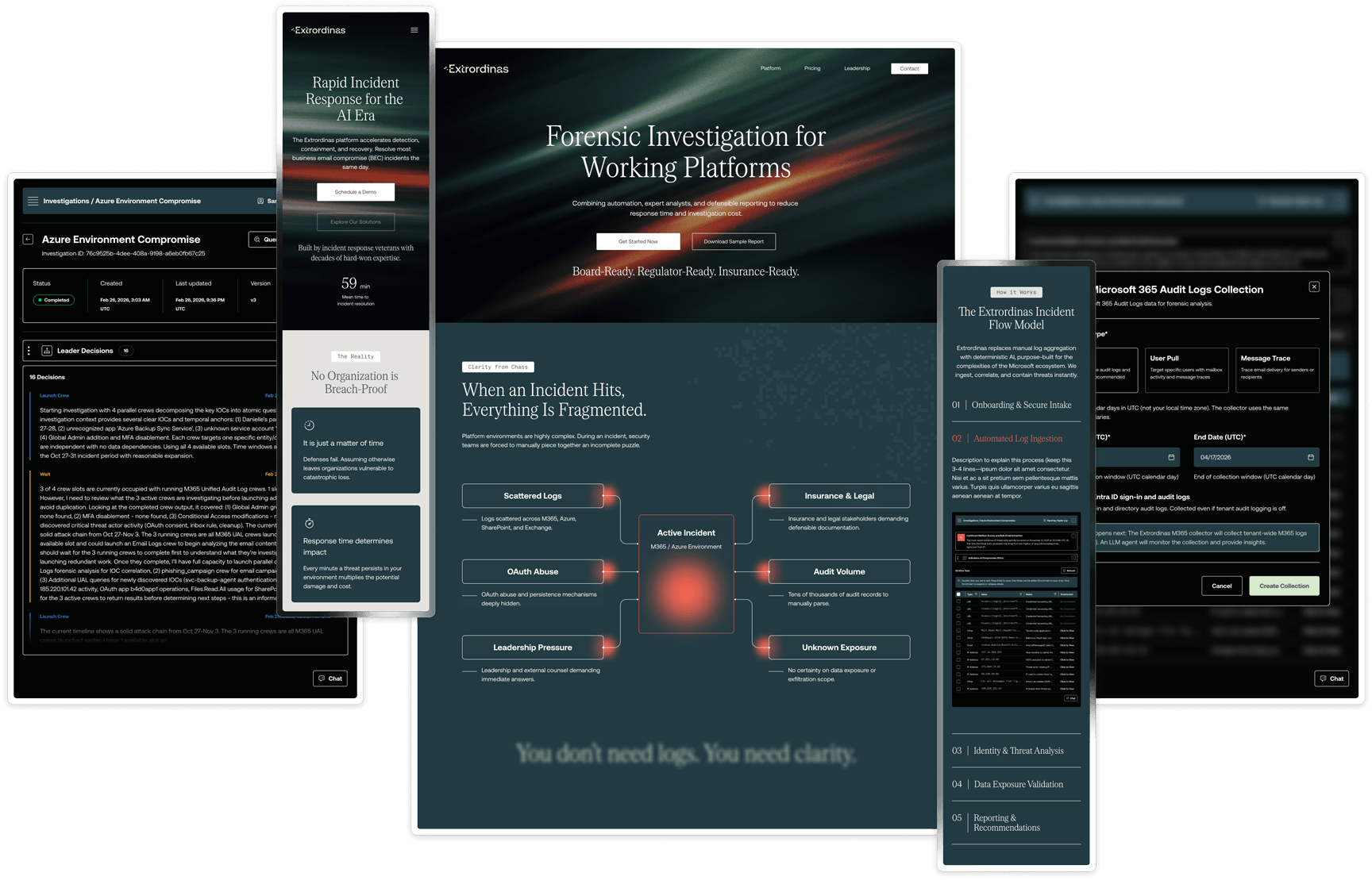
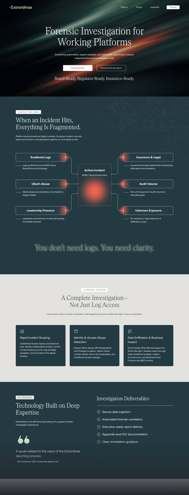
The visual language was informed directly by the competitive benchmarking phase—dark backgrounds, high-contrast typography, and a restrained accent color used intentionally rather than decoratively. Extrordinas needed to look like it belonged in the enterprise security space without feeling cold or inaccessible.
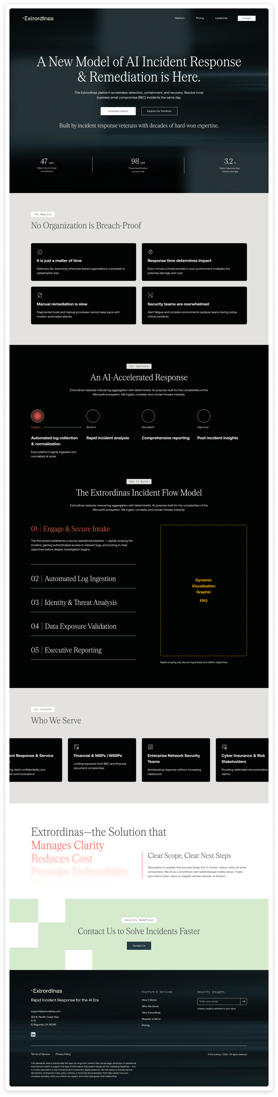
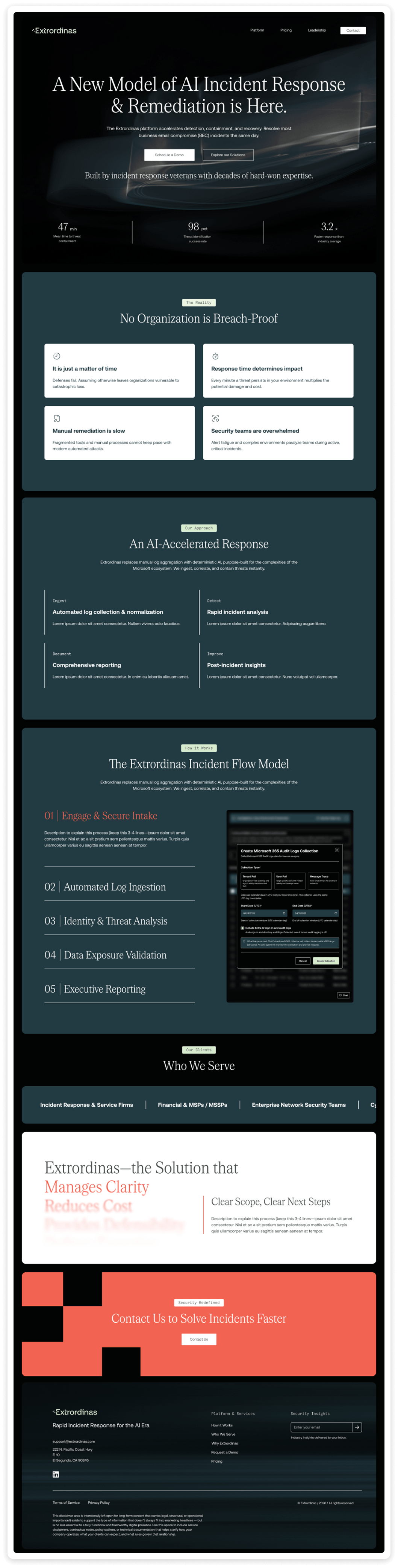
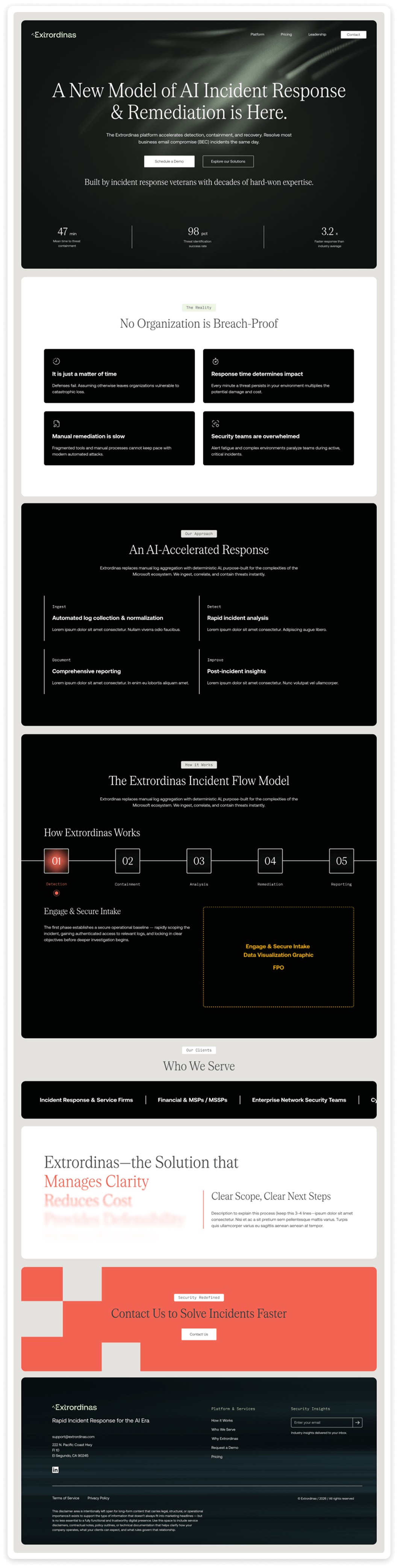
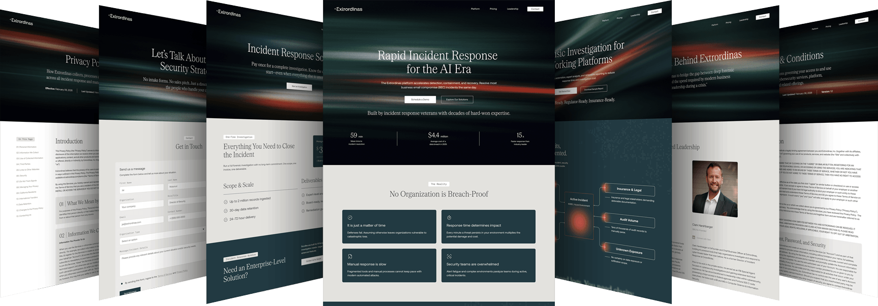
With the design system built and the high-fidelity direction approved, I designed the full site at two breakpoints—1440px desktop and 393px mobile. No explicit tablet breakpoint was designed; the two-breakpoint approach was a deliberate scoping decision that kept the build focused and the handoff clean.

Design doesn't ship—code does. The handoff document is where the design work either holds up or falls apart.
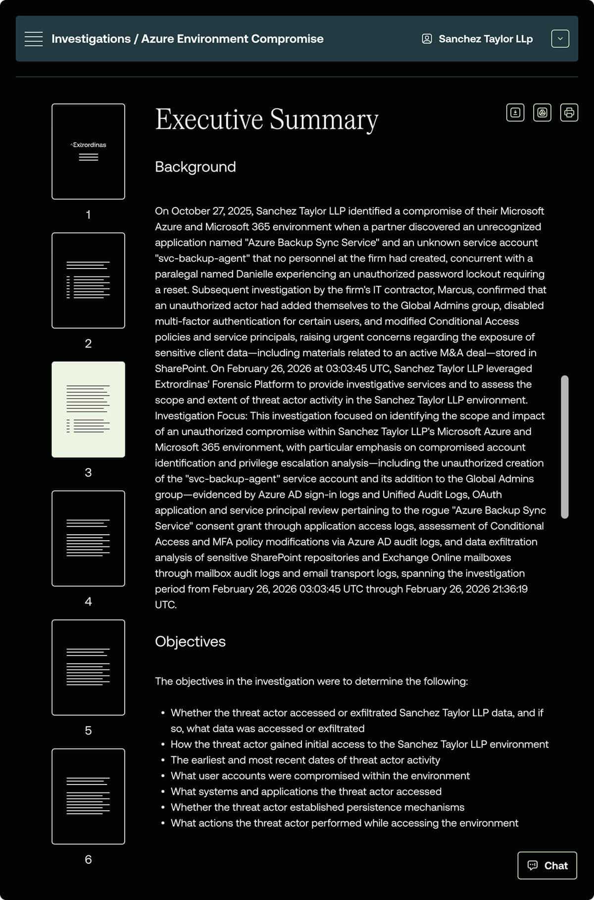
For Extrordinas, I built a 14-section developer handoff reference in Notion that covers everything a developer needs to move from Figma to production without guesswork or back-and-forth. The document was built in parallel with the final design phase and updated through the handoff review meeting.
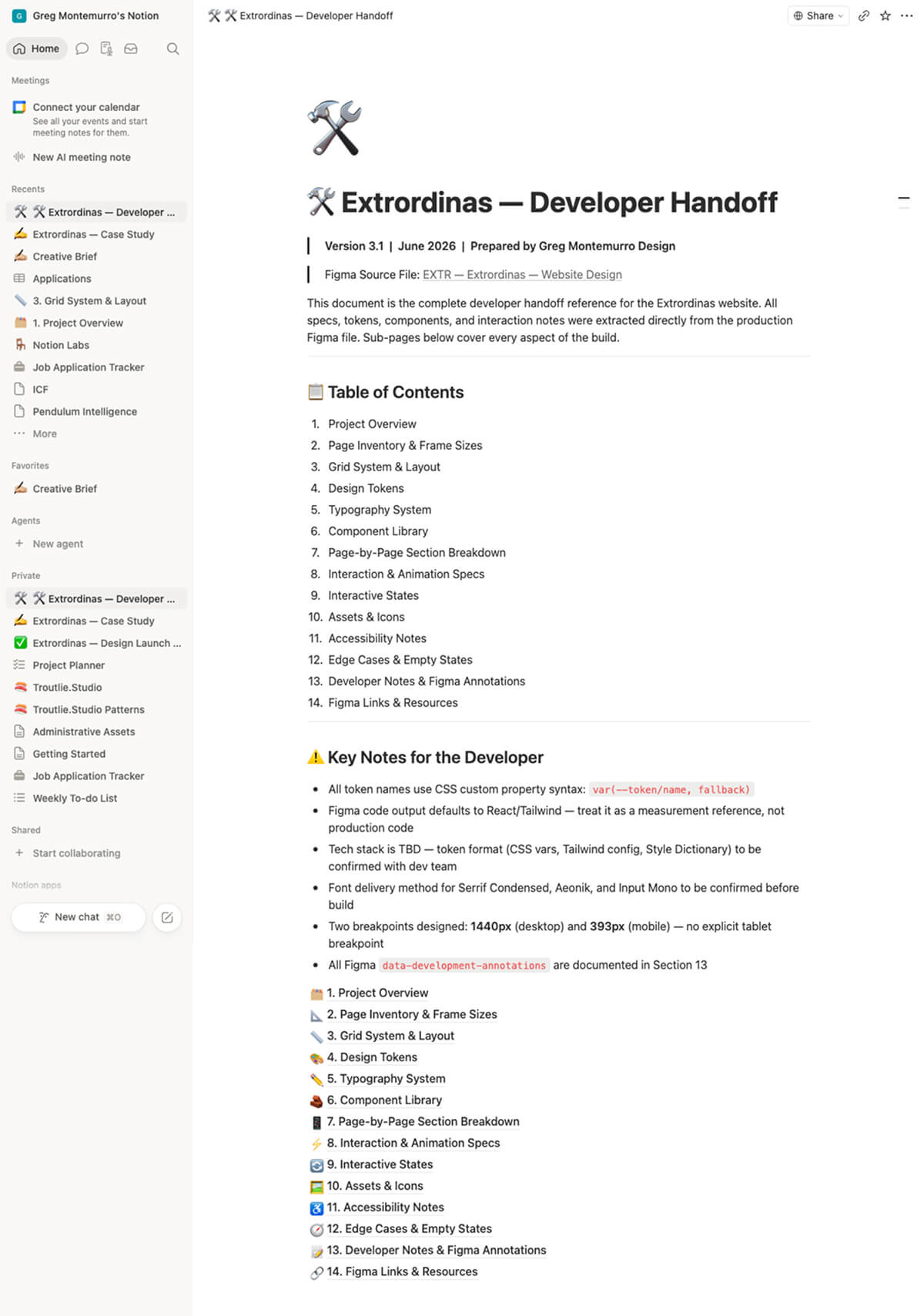
The token naming convention uses CSS custom property syntax throughout—var(--token/name, fallback)—so the developer has a clear path to implementation regardless of whether the final tech stack lands on CSS variables, a Tailwind config, or Style Dictionary. The Figma file was built with the same naming discipline: layer names, component labels, and variable references were all structured to align with standard React component library conventions.
At the handoff review meeting, the developer's feedback said it all: "The file is clean and well-documented. This should be seamless. I've got everything I need in the file and in Notion."
This was the most process-intensive project I've taken on as a freelancer—and the one that changed how I work more than any other.
Going into it, I knew the starting point was thin. No existing brand system, no site to react to, a technically complex product, and a compressed timeline. What I didn't fully anticipate was how much the AI-augmented workflow would close that gap—not by doing the design work, but by handling the organizational and extrapolation work that usually eats the first quarter of a project.
The IA synthesis, the color tint extrapolation, the typography variable structure—none of that required creative judgment. It required time and attention. Handing those tasks to Claude gave me both back, and I put them directly into the decisions that actually needed a designer in the room: content sequencing, layout hierarchy, visual language, and the structural logic of a handoff document that a developer could actually build from.
I would push for a formal wireframe review checkpoint before moving to high fidelity. The wireframes held up, but a structured client review at that stage would have caught any structural assumptions earlier and given the high-fidelity phase a cleaner runway.
I would also document the competitive benchmarking more formally from the start. The insights from the Specular.ai and Blink Freight reviews were genuinely useful—they shaped the visual language and content approach in concrete ways. Having those captured in a shareable artifact earlier would have made the design rationale easier to communicate during stakeholder reviews.
The site hasn't launched yet—this case study will be updated with performance data and client feedback once it does.