Transforming an outdated digital presence into a sophisticated platform that mirrors the precision and luxury of Botsko’s physical craftsmanship.
Botsko Builders is a custom luxury home builder with decades of experience in Middle Tennessee. Despite a strong reputation and high-quality work, their website did not reflect the level of craftsmanship, clarity, or guided experience expected by their target audience.
I led UX strategy and website planning to define a clearer brand narrative, prioritize high-value residential audiences, and create a scalable digital foundation that emphasized experience, trust, and custom craftsmanship.
While Botsko Builders had a strong reputation and portfolio, their digital presence failed to communicate what truly differentiated them: a deeply guided, custom homebuilding experience.
The existing site lacked cohesive messaging, clear navigation, and sufficient visual storytelling, making it difficult for prospective clients to understand the value of Botsko’s process—or feel confident taking the next step
As a result, the website did not fully support the sales process or reflect the premium, guided experience Botsko provides its clients.
This project required a pragmatic, senior-level approach shaped by real-world constraints:
Rather than attempting to solve everything at once, the focus was on clarity, prioritization, and long-term scalability.
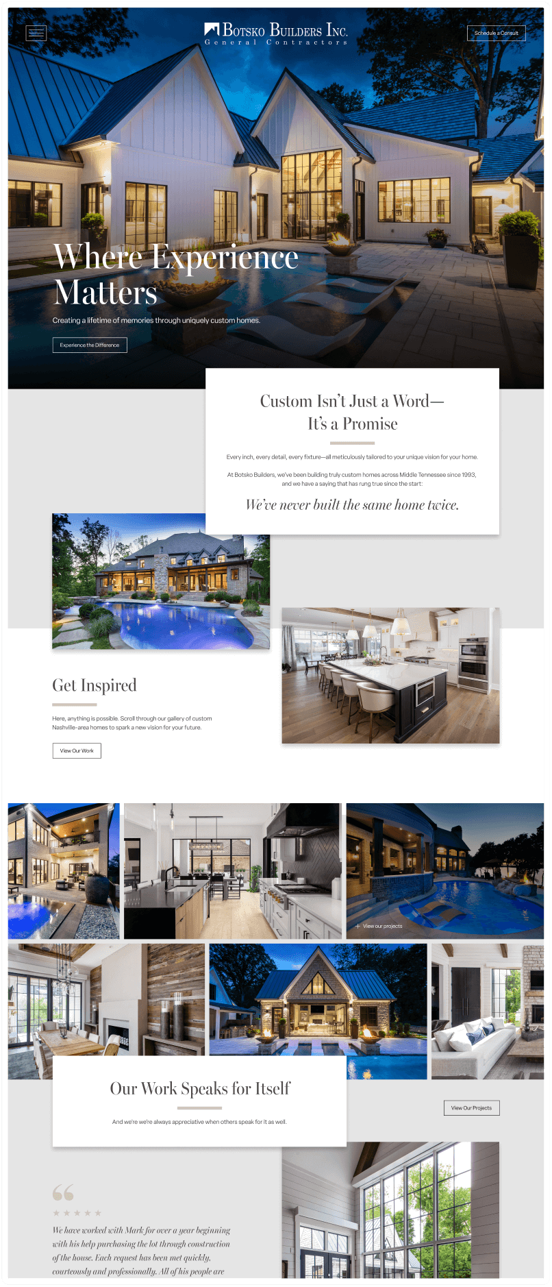
The core strategic shift was reframing the website from a portfolio of homes into a guided experience. Instead of asking users to interpret Botsko’s value on their own, the site needed to clearly answer:
Execution and solution ideation focused on the following priorities:
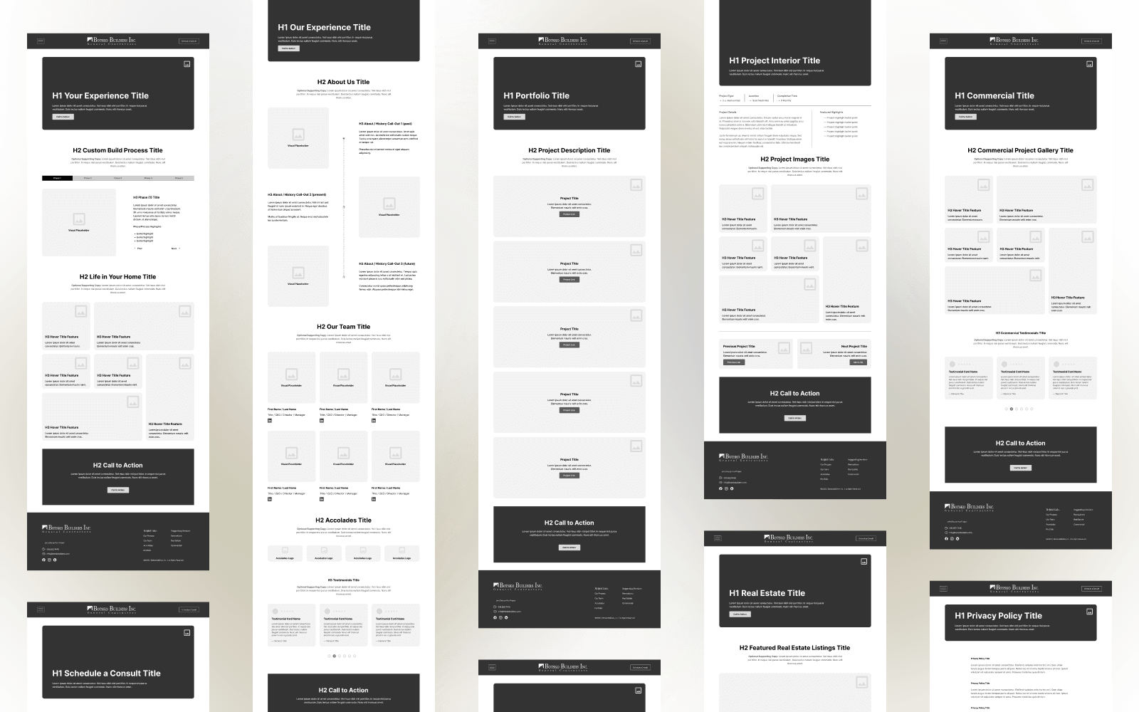
The design process focused on reducing ambiguity, aligning stakeholders, and creating a clear framework that could support both immediate redesign and future iteration. We created a series of experience-based and visual artifacts to support this initiative.
Rather than designing for a generic luxury buyer, I defined two primary audience archetypes—the Affluent Legacy Builder and the Trailblazing Professional—each with distinct motivations, fears, and decision-making styles.
These personas informed tone, content hierarchy, and the balance between tradition and modernity throughout the site.
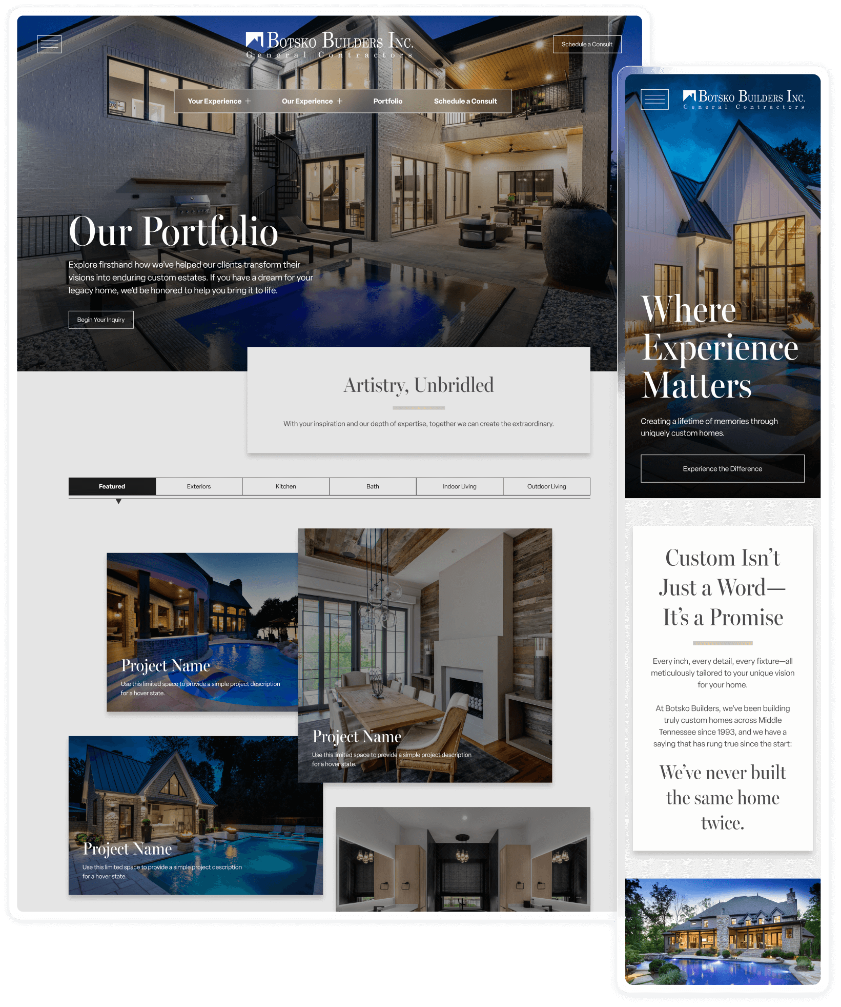
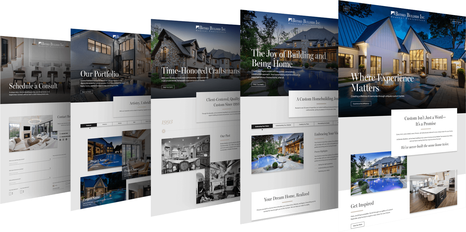
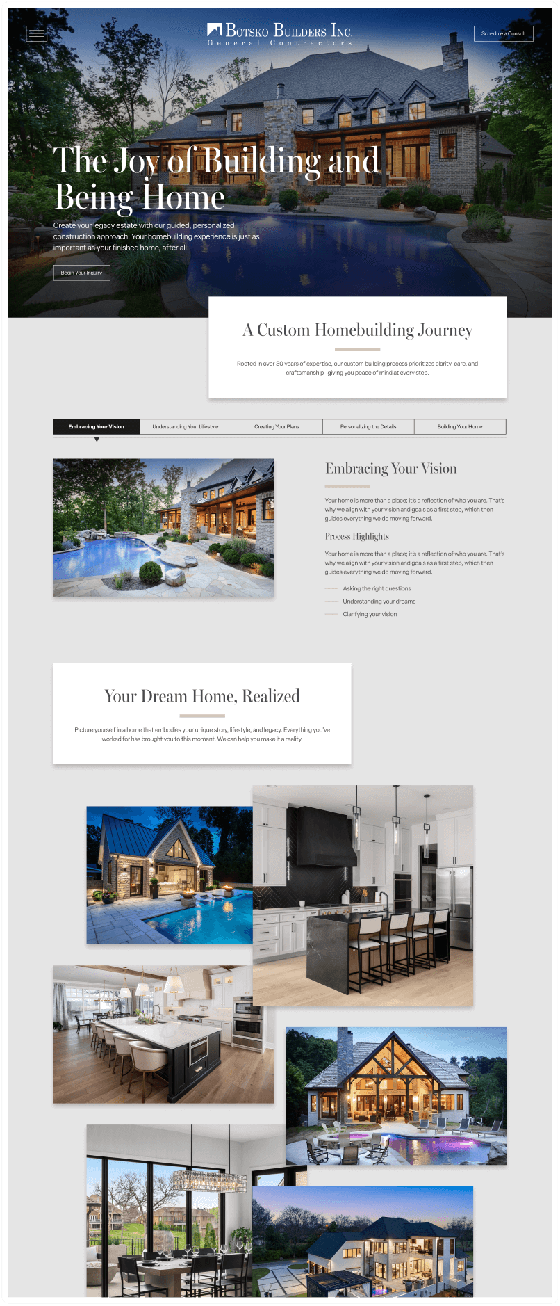
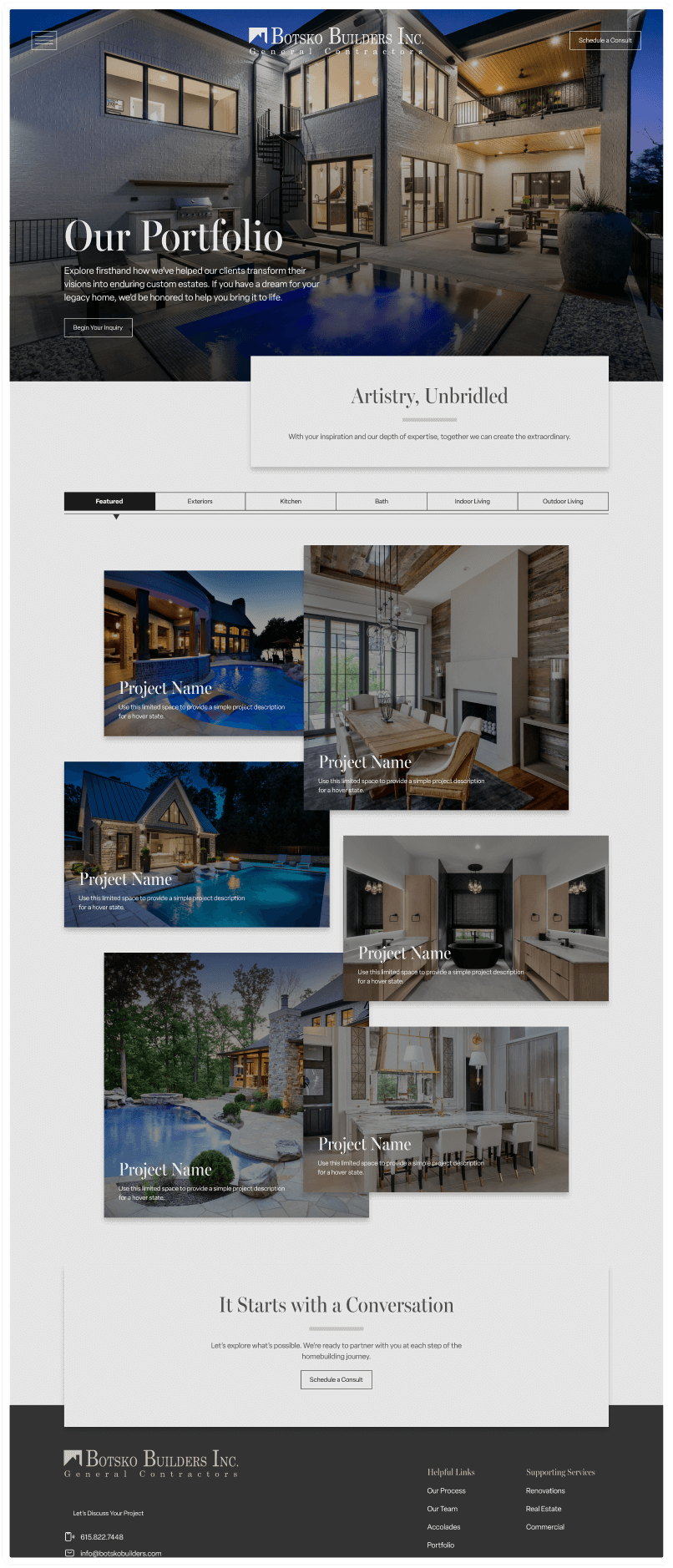
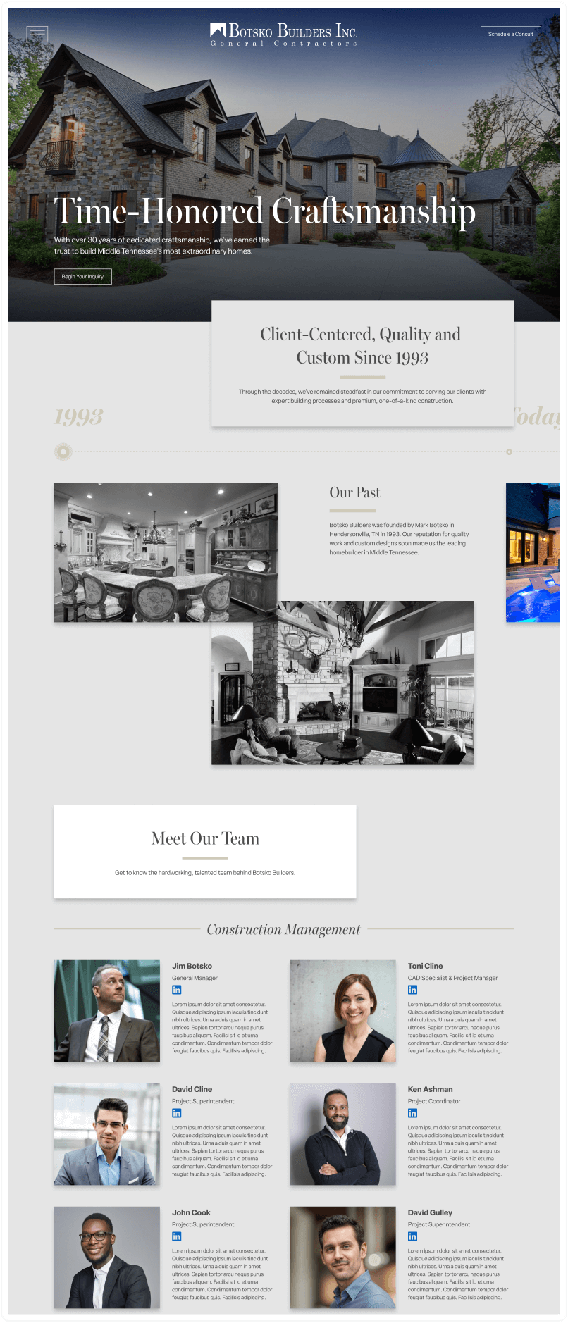
Navigation was intentionally structured around the client journey rather than internal service categories. Pages like Your Experience and Our Experience reframed the site around guidance and partnership, helping users understand not just what Botsko builds, but how they build.
Top-level navigation and interior content pages prioritized emotional reassurance, social proof, and clear next steps—balancing inspiration with decisive calls to action. Testimonials, portfolio imagery, and messaging were woven together to build confidence without overwhelming users.
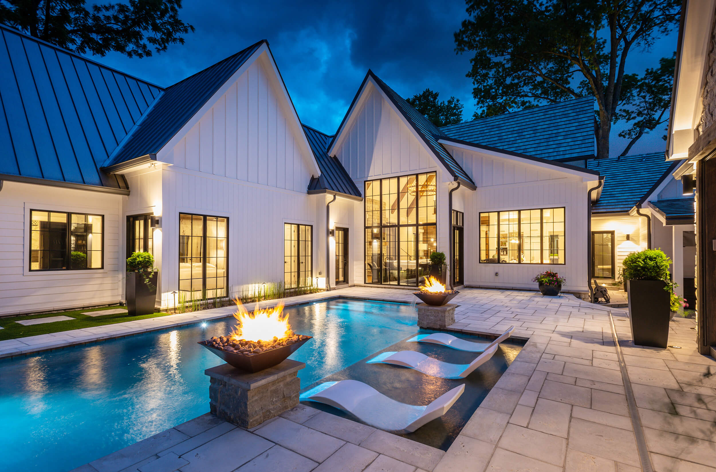
Visual decisions emphasized restraint, warmth, and timelessness—supporting a premium feel without appearing cold or inaccessible. Voice and tone guidelines reinforced calm confidence, reflecting the brand’s decades of experience.
Rather than designing for a generic “luxury buyer,” two primary audience archetypes were defined to guide decision-making for Botsko Builders.

High-net-worth individuals focused on quality, legacy, and long-term value. They value trust, craftsmanship, and a calm, guided process.


Younger, success-driven clients seeking distinction, modernity, and efficiency. Their homes are expressions of identity and achievement.

Navigation was intentionally structured around the client journey, not internal service categories. Primary sections such as Your Experience and Our Experience reframed the site around partnership, guidance, and process—helping users understand not just what Botsko builds, but how they work and why that matters.
Secondary services remained accessible but were deliberately de-emphasized to maintain focus on residential custom builds.

Top-level and interior page content was designed to balance inspiration with reassurance.
Messaging prioritized confidence and lifestyle-building over feature listing, recognizing that high-consideration users move forward only when they feel understood and supported.
Visual decisions emphasized restraint, warmth, and timelessness—supporting a premium feel without appearing cold or inaccessible. Voice and tone guidelines reinforced calm confidence, reflecting the brand’s decades of experience.
The strategic roadmap provided Botsko with a clear, unified direction for their digital presence—aligning brand, content, and structure around the experience they deliver in real life.
The result was a website framework designed to support higher-quality inquiries, clearer differentiation in a competitive market, and long-term scalability as the brand continues to evolve.
Clear brand positioning that conveys quality of craft, refinement and attention to detail that Botsko Builders exemplifies in their core values— in the conference room and on the construction site.
The site speaks volumes and resonates deeply with the client base most likely to value the services and expertise Botsko Builders provides.
Content and navigation components were designed with flexibility in mind. We focused attention on strategies that scale and evolve with project frameworks and business development processes.
Alignment across stakeholders was critical before design and development were implemented. We were able to maintain open lines of communication across project teams and stakeholders to refine and validate content and visual assets.
This project reinforced the importance of UX strategy as a foundation, not a formality. By slowing down early and aligning on audience psychology, messaging, and structure, the roadmap reduced downstream risk and created clarity before any visual design decisions were made.
It also highlighted how senior UX work often centers on prioritization—deciding what not to emphasize in order to protect focus, clarity, and long-term brand integrity.
This experience continues to shape how I approach complex, high-consideration digital projects where trust, guidance, and confidence matter as much as aesthetics.