Transforming Nashville Dip Pools' Website to Educate Buyers and Boost Conversions.
Nashville Dip Pools is a regional, high-consideration purchase offering multiple custom pool options. The existing website struggled to clearly communicate product differences, guide first-time buyers, and support confident decision-making.I led UX and UI design with a focus on reducing cognitive load, clarifying product structure, and creating a scalable foundation for future optimization in a low-maturity analytics environment.
Dip pool products are unfamiliar to many users and represent a significant financial investment. The existing site presented too many options without clear differentiation, making it difficult for users to understand tradeoffs or feel confident moving forward.
From a business perspective, this created friction in the early decision-making phase and limited the site’s ability to effectively support inquiries and conversions.
I realized quickly there were significant challenges that needed to be addressed early in the process. I shifted focus to begin navigating challenges and ambiguity.
I led the UX and UI design process end-to-end, partnering with stakeholders to define priorities, structure complex product information, and advocate for clarity-driven design decisions.
My focus was less on visual novelty and more on creating an intentional, understandable experience that could scale as the business, dip pool types and product lines evolved.
Given the complexity of the product offering and limited analytics, I prioritized structural clarity over experimentation. Key decisions included:
The design process was intentionally lightweight and focused on clarity, prioritization, and alignment. Each step was used to validate assumptions and reduce ambiguity, rather than as a rigid checklist. I focused my attention on creating

To better understand both the business and its customers, I conducted stakeholder interviews with NDP staff members. I also completed a competitive benchmarking session, focused on local and regional pool installation companies.
A key insight emerged: potential customers were not confused by whether they wanted a dip pool—but by what type of dip pool made sense for their lifestyle, space, and budget. This insight informed both the content strategy and the site’s structure. The question became: Who buys a dip pool and why?

Purchasing motivations:

Purchasing motivations:

Purchasing motivations:
The site map was intentionally configured to accommodate our users needs. I focused on the following goals:
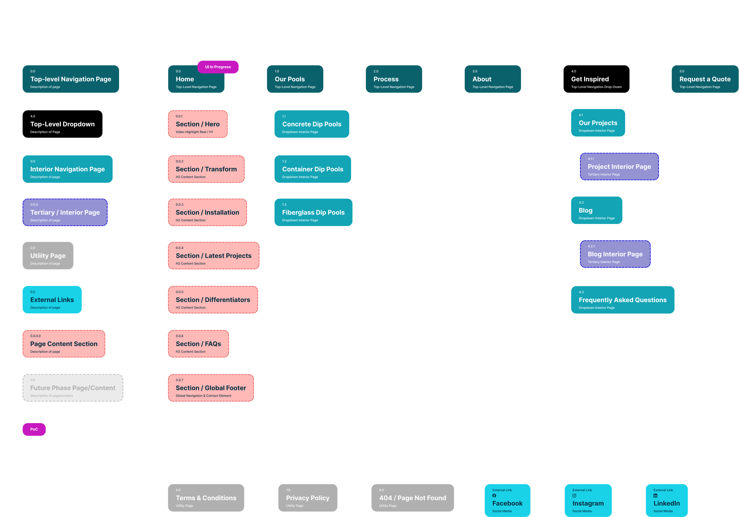
These wireframes focused on content first, allowing structure and messaging to guide layout decisions rather than aesthetics alone. Once structure was validated, they were sent to a copywriter to create content around these key elements:
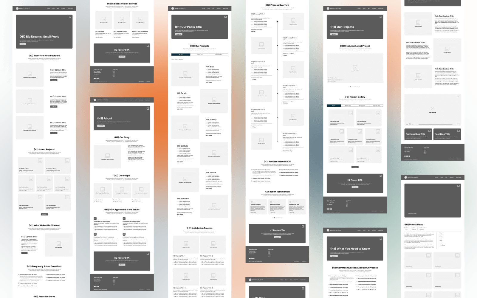
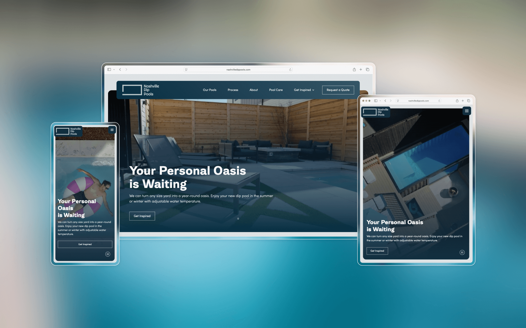
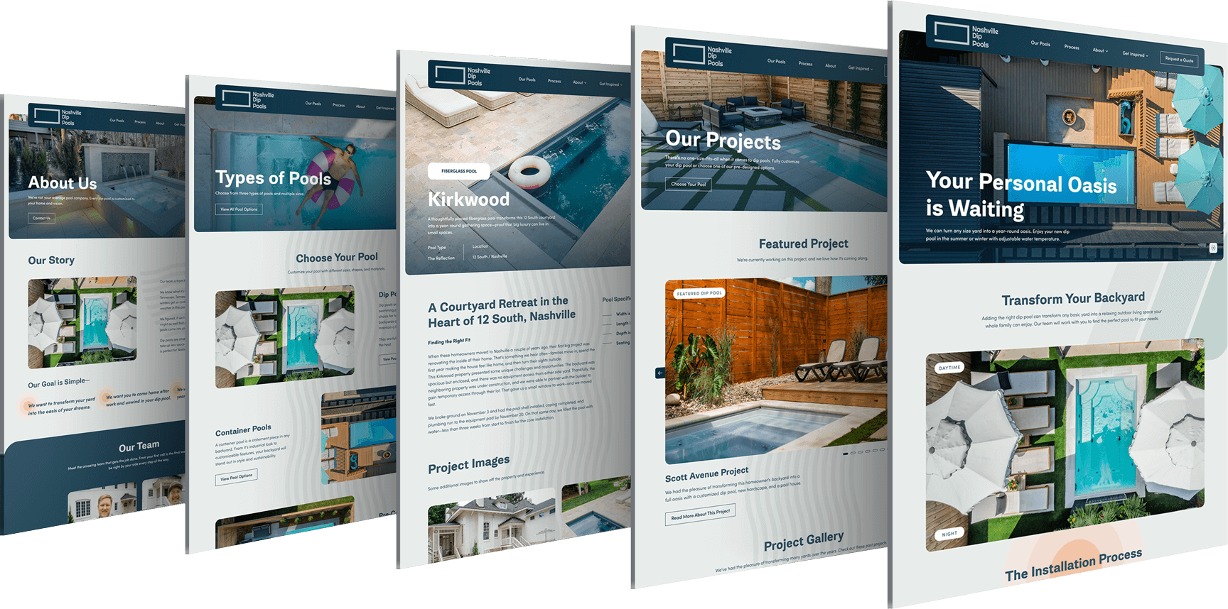
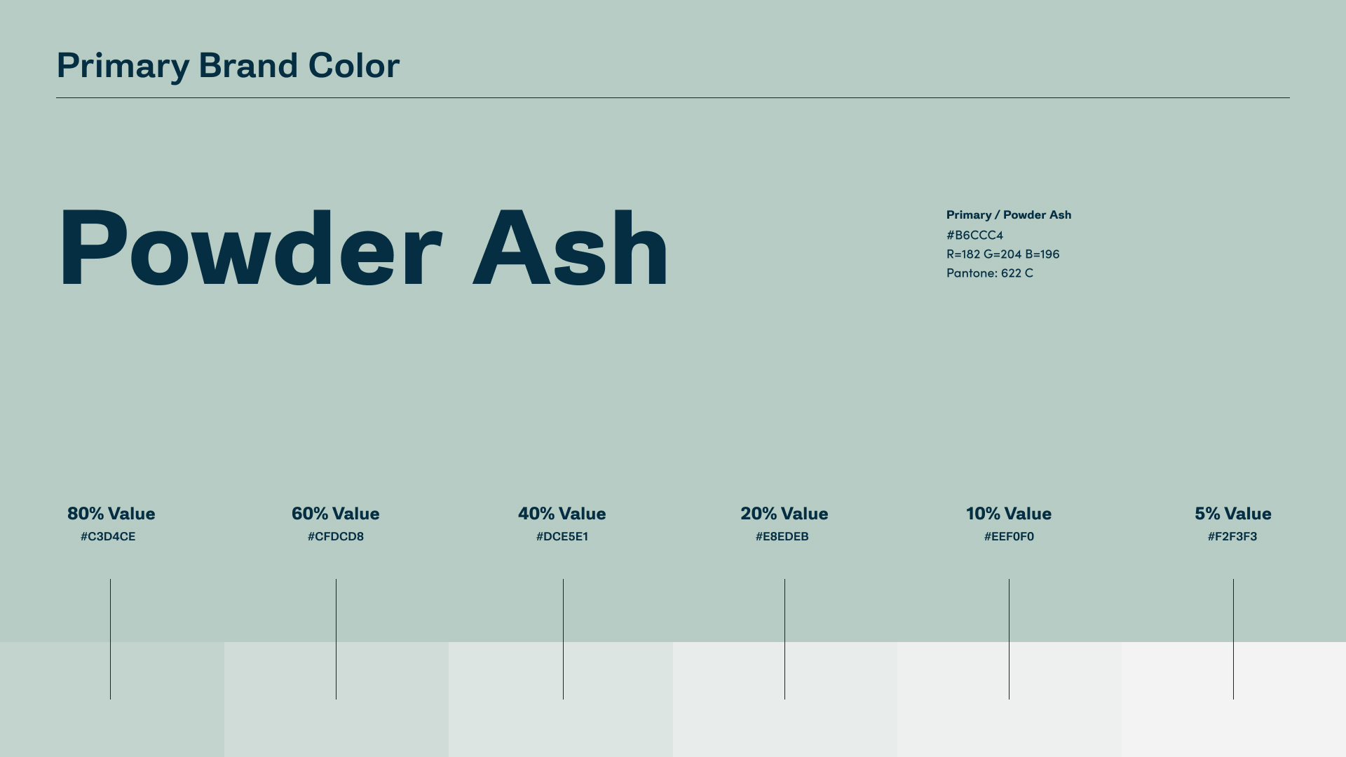
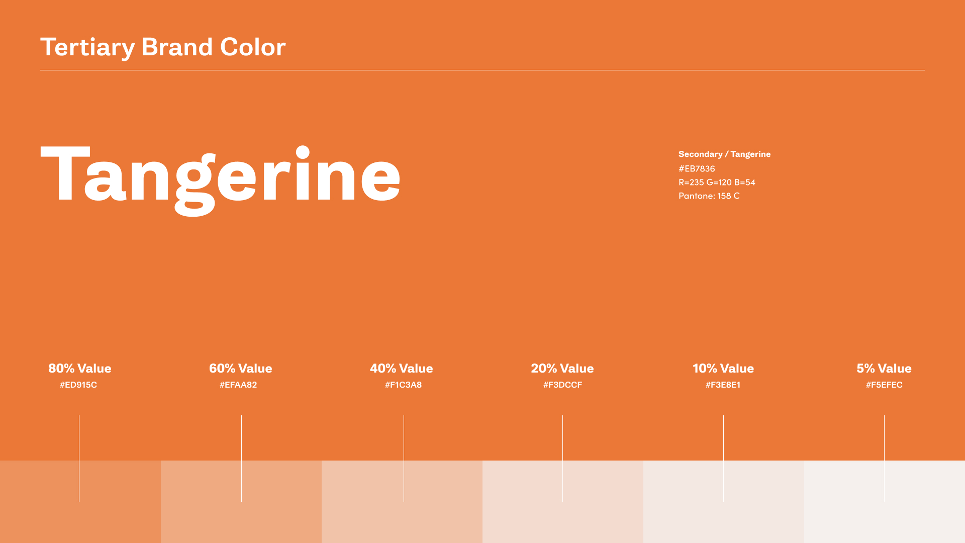
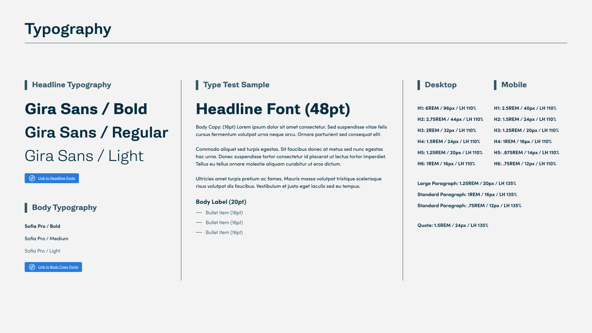
Once the content was solidified, I began integrating brand assets with the wireframe artifacts to build and explore high fidelity comps in the desktop and mobile responsive environments. The UI section of my Figma file included:
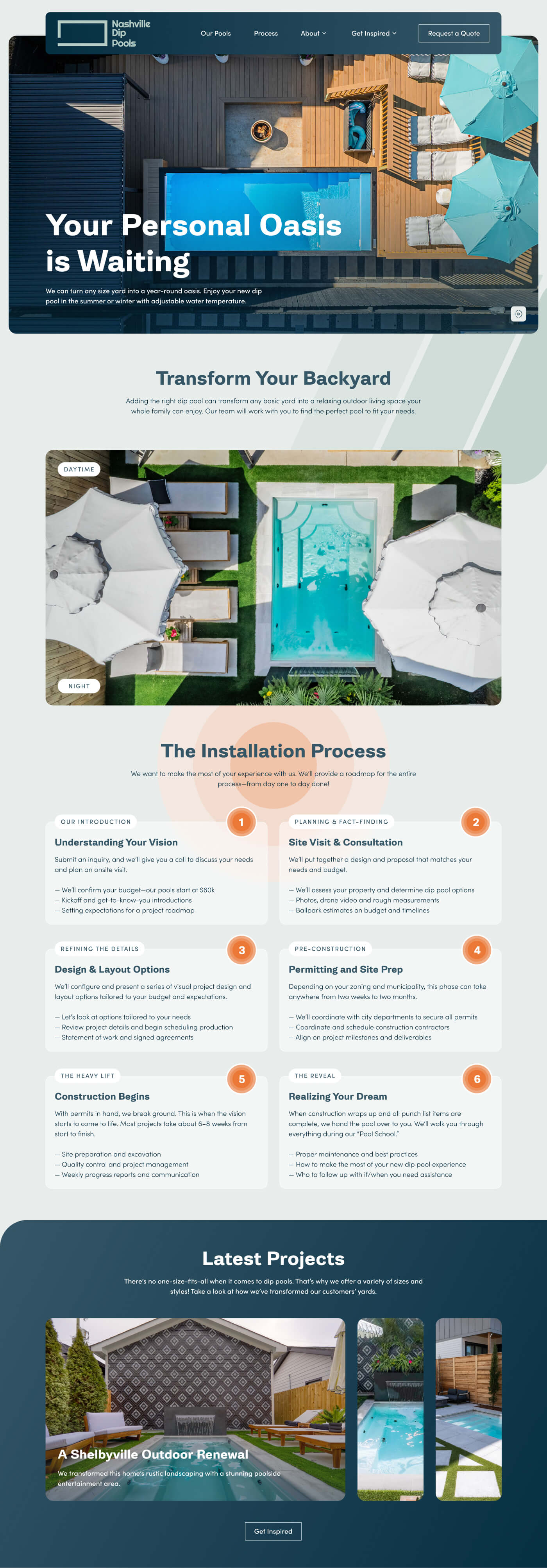
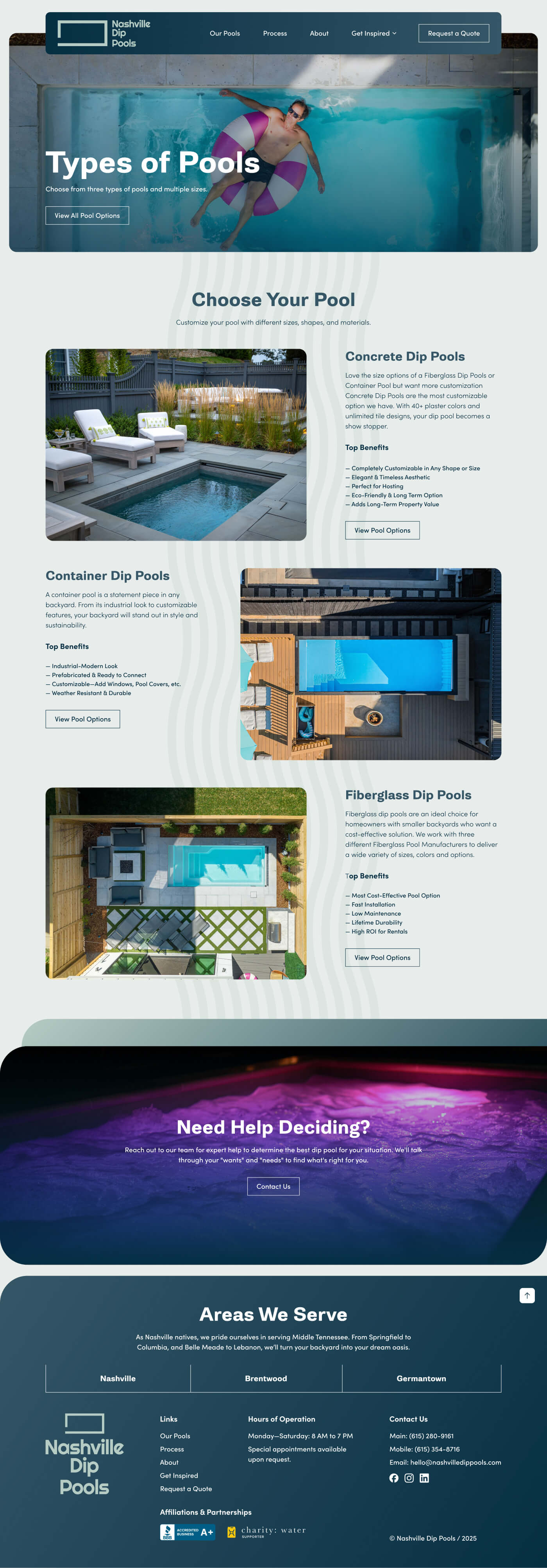
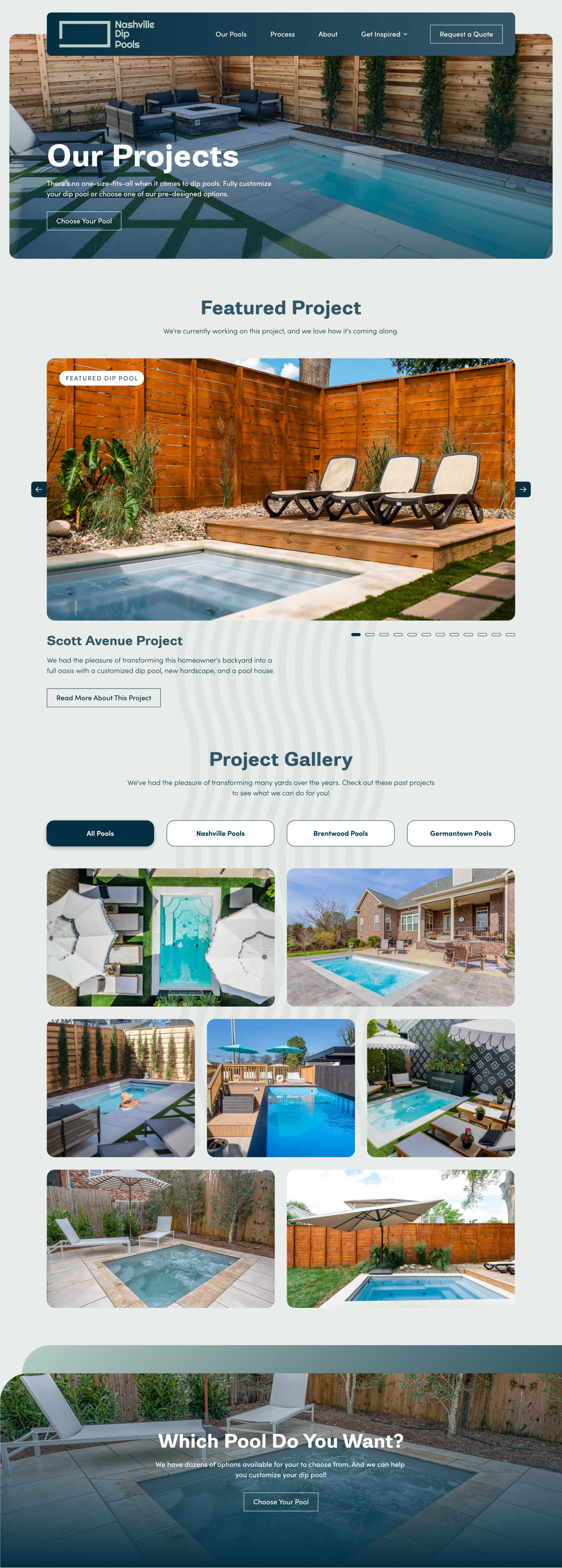
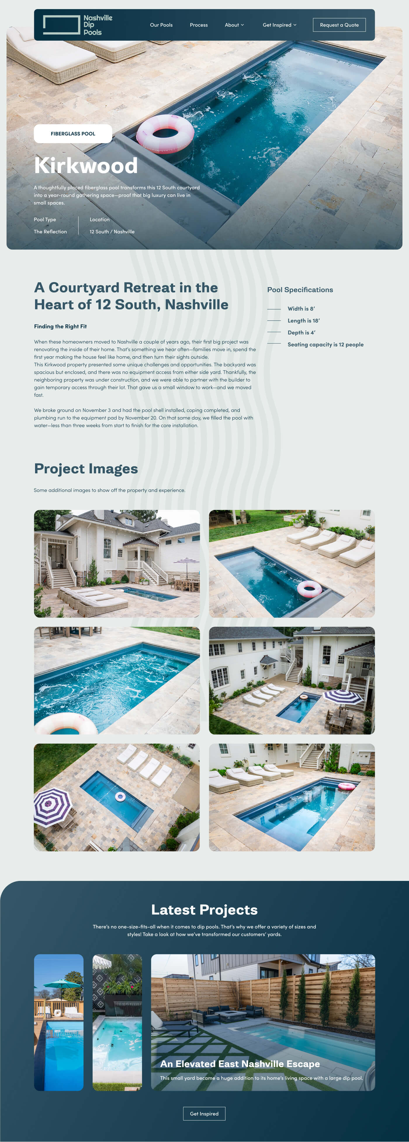
To support our goals, we focused on optimizing calls to action and educational content on the following high-traffic pages:


I was impressed how Greg invested the time to understand not only my needs, but the needs of my customers. The Nashville Dip Pools site turned out far better than I could have expected. The quality of our leads improved instantly. Our site traffic increased by 3X, and our social media has grown exponentially. We went viral on the day after the site launched!
While the client did not have mature UX analytics in place, the redesigned experience delivered several meaningful improvements aligned with the original goals of clarity, differentiation, and lead quality.
The new information architecture and product organization helped first-time visitors more easily understand differences between pool materials and sizes, reducing ambiguity early in the decision-making process.
Standardized comparison patterns and clearer content hierarchy supported more informed evaluation without overwhelming users unfamiliar with dip pool options.
Following launch, the client reported a noticeable increase in inbound leads that were better aligned with their ideal customer profiles, suggesting improved user understanding prior to outreach.
The redesigned structure and component-based system created a more maintainable platform, enabling future optimization and measurement as the organization’s analytics capabilities mature.
I recommended the implementation of additional tracking tools, including heatmaps and funnel analysis, to better quantify user behavior and conversion performance. While these were not fully adopted during the project, the site was intentionally designed to support future data-driven iteration.
This project reinforced the importance of principled UX decision-making in environments with low analytics maturity. In the absence of robust quantitative data, I relied on clear problem framing, established UX heuristics, and close stakeholder collaboration to guide design decisions.
It also highlighted the value of prioritizing structural clarity and scalability early, particularly for high-consideration products where user understanding directly impacts lead quality. The experience informed how I approach similar projects—focusing less on surface-level polish and more on creating resilient systems that can evolve as measurement and organizational maturity improve.